Big Picture
Tutorial 2 built a feature table with 18 features per draw. That table is powerful, but it also means bugs can hide. A feature with the wrong formula might still produce numbers. A pipeline error might create subtle shifts in distributions.
This tutorial is the comprehensive check that sits between feature engineering and formal analysis. The goal: make sure the feature table behaves the way random lottery data should before we test deeper hypotheses.
1. Where We Are in the Journey
Tutorial 1 validated raw draws and filtered by format. Tutorial 2 transformed those draws into features. Now we have a dataset with 1,269 rows (one per draw) and 18 columns (features plus identifiers).
Tutorial 3 performs exploratory analysis on that dataset. We compute summary statistics. We visualize distributions. We check if they match what randomness predicts.
Tutorial 4 will run formal probability tests. Those tests assume the data is clean. Tutorial 3 verifies that assumption.
The workflow: raw data → validated data → feature table → exploratory analysis → hypothesis testing → modeling.
We are at step four.
2. What Is Exploratory Data Analysis?
EDA is the process of understanding your data before you analyze it formally. You compute summaries. You make plots. You look for patterns, outliers, and mistakes.
The goal is not to test hypotheses yet. The goal is to build intuition and catch errors.
3. The Three Checks We Will Run
Each of the four plots we generate is a one-dimensional slice of your 15-dimensional feature table. We check them one by one to ensure the whole table is sane.
Compute mean and standard deviation for key features. Check if they match expectations.
mean feature should be around 35. If it is 42, something is wrong.Plot histograms and compare them to theoretical expectations.
odd_count histogram should peak at 2-3 and be low at 0 and 5. If it looks flat, your parity calculation is broken.Plot features over time to check for stability.
mean over time. It should fluctuate randomly around 35. If it drifts upward or downward, that suggests a problem.mean calculation has a typo and always returns values 5 points too high. Your tests will "discover" that draws are biased high. But that discovery is fake. EDA catches those mistakes before you waste time investigating fake signals.4. Code Roadmap: What the Script Does (and Why This Order)
The script performs four main steps:
Read the feature table created in Tutorial 2.
Calculate mean and standard deviation for key features like draw mean, odd count, and range.
Generate four visualizations: mean distribution, odd count distribution, decade distribution, and mean over time.
Display a summary of what to look for in each plot.
5. Python Implementation
Here is the complete script. It loads the feature table and creates diagnostic plots.
"""Tutorial 3: Validate the feature table through exploratory analysis"""

import pandas as pd
import numpy as np
import matplotlib.pyplot as plt

# --- Load feature table ---

print("Loading feature table from Tutorial 2...")
features = pd.read_parquet('data/processed/features_powerball.parquet')
print(f"Loaded {len(features)} draws with {len(features.columns)} features")

# --- Compute summary statistics ---

print("\nSummary Statistics:")

# For the mean feature, we expect around 35
mean_of_means = features['mean'].mean()
std_of_means = features['mean'].std()
print(f"\nDraw Mean:")
print(f"  Average: {mean_of_means:.2f} (expect ~35)")
print(f"  Std Dev: {std_of_means:.2f}")

# For odd count, we expect around 2.5
mean_odd_count = features['odd_count'].mean()
std_odd_count = features['odd_count'].std()
print(f"\nOdd Count:")
print(f"  Average: {mean_odd_count:.2f} (expect ~2.5)")
print(f"  Std Dev: {std_odd_count:.2f}")

# For range, we expect varied values
mean_range = features['range'].mean()
std_range = features['range'].std()
print(f"\nRange:")
print(f"  Average: {mean_range:.2f}")
print(f"  Std Dev: {std_range:.2f}")

# --- Create distribution plots ---

print("\nCreating diagnostic plots...")

# Plot 1: Distribution of means
plt.figure(figsize=(10, 6))
plt.hist(features['mean'], bins=30, color='steelblue', edgecolor='black', alpha=0.7)
plt.axvline(x=35, color='red', linestyle='--', linewidth=2, label='Expected (35)')
plt.axvline(x=mean_of_means, color='green', linestyle='-', linewidth=2, label=f'Observed ({mean_of_means:.1f})')
plt.xlabel('Draw Mean', fontsize=12)
plt.ylabel('Frequency', fontsize=12)
plt.title('Distribution of Draw Means (Should Center Near 35)', fontsize=14)
plt.legend()
plt.grid(axis='y', alpha=0.3)
plt.tight_layout()
plt.savefig('outputs/tutorial3/mean_distribution.png', dpi=150)
plt.close()
print("  Saved: mean_distribution.png")

# Plot 2: Odd count distribution
odd_count_frequencies = features['odd_count'].value_counts().sort_index()

# Theoretical probabilities (from binomial distribution)
total_draws = len(features)
expected_frequencies = {
    0: 0.029 * total_draws,
    1: 0.153 * total_draws,
    2: 0.318 * total_draws,
    3: 0.330 * total_draws,
    4: 0.170 * total_draws,
    5: 0.034 * total_draws
}

plt.figure(figsize=(10, 6))

x_positions = np.arange(6)
bar_width = 0.35

# Plot observed vs expected
observed_values = [odd_count_frequencies.get(i, 0) for i in range(6)]
expected_values = [expected_frequencies[i] for i in range(6)]

plt.bar(x_positions - bar_width/2, observed_values, bar_width,
        label='Observed', color='steelblue', edgecolor='black')
plt.bar(x_positions + bar_width/2, expected_values, bar_width,
        label='Expected', color='coral', edgecolor='black', alpha=0.7)

plt.xlabel('Number of Odd Balls', fontsize=12)
plt.ylabel('Frequency', fontsize=12)
plt.title('Odd Count Distribution (Should Peak at 2-3)', fontsize=14)
plt.xticks(x_positions, x_positions)
plt.legend()
plt.grid(axis='y', alpha=0.3)
plt.tight_layout()
plt.savefig('outputs/tutorial3/oddcount_distribution.png', dpi=150)
plt.close()
print("  Saved: oddcount_distribution.png")

# Plot 3: Decade buckets
decade_columns = ['decade_00_09', 'decade_10_19', 'decade_20_29',
                  'decade_30_39', 'decade_40_49', 'decade_50_59', 'decade_60_69']
decade_totals = [features[col].sum() for col in decade_columns]

plt.figure(figsize=(10, 6))
decades = ['0-9', '10-19', '20-29', '30-39', '40-49', '50-59', '60-69']
plt.bar(decades, decade_totals, color='steelblue', edgecolor='black')
plt.xlabel('Decade', fontsize=12)
plt.ylabel('Total Hits', fontsize=12)
plt.title('Decade Distribution (Should Be Roughly Balanced)', fontsize=14)
plt.grid(axis='y', alpha=0.3)
plt.tight_layout()
plt.savefig('outputs/tutorial3/decade_distribution.png', dpi=150)
plt.close()
print("  Saved: decade_distribution.png")

# Plot 4: Mean over time
features['draw_date'] = pd.to_datetime(features['draw_date'])
features_sorted = features.sort_values('draw_date')

plt.figure(figsize=(12, 6))
plt.scatter(features_sorted['draw_date'], features_sorted['mean'],
            alpha=0.3, s=10, color='steelblue', label='Draw Mean')

# Add a rolling average to see if there's a trend
rolling_window = 50
rolling_mean = features_sorted['mean'].rolling(window=rolling_window, center=True).mean()
plt.plot(features_sorted['draw_date'], rolling_mean,
         color='red', linewidth=2, label=f'Rolling Average ({rolling_window} draws)')

# Add expected value line
plt.axhline(y=35, color='green', linestyle='--', linewidth=1.5, label='Expected (35)')

plt.xlabel('Date', fontsize=12)
plt.ylabel('Draw Mean', fontsize=12)
plt.title('Draw Mean Over Time (Should Be Stable Around 35)', fontsize=14)
plt.legend()
plt.grid(alpha=0.3)
plt.tight_layout()
plt.savefig('outputs/tutorial3/mean_over_time.png', dpi=150)
plt.close()
print("  Saved: mean_over_time.png")

# --- Final summary ---

print("\nEDA Complete!")
print("\nAll plots saved to: outputs/tutorial3/")
print("\nWhat to look for:")
print("  - Mean distribution: should center near 35")
print("  - Odd count: should peak at 2-3")
print("  - Decades: should be roughly balanced")
print("  - Mean over time: should be stable (no upward/downward trends)")
6. How to Run the Script
- You must have run Tutorial 2 first (to create
features_powerball.parquet) - Create the output folder:
mkdir outputs/tutorial3pip install matplotlib# Windows (PowerShell)
cd C:\path\to\tutorials
python tutorial3_eda_validation.py# Mac / Linux (Terminal)
cd /path/to/tutorials
python3 tutorial3_eda_validation.py7. How to Interpret the Outputs
After running the script, you will have four plots. Here is how to read them.
Compare your output to these reference examples:
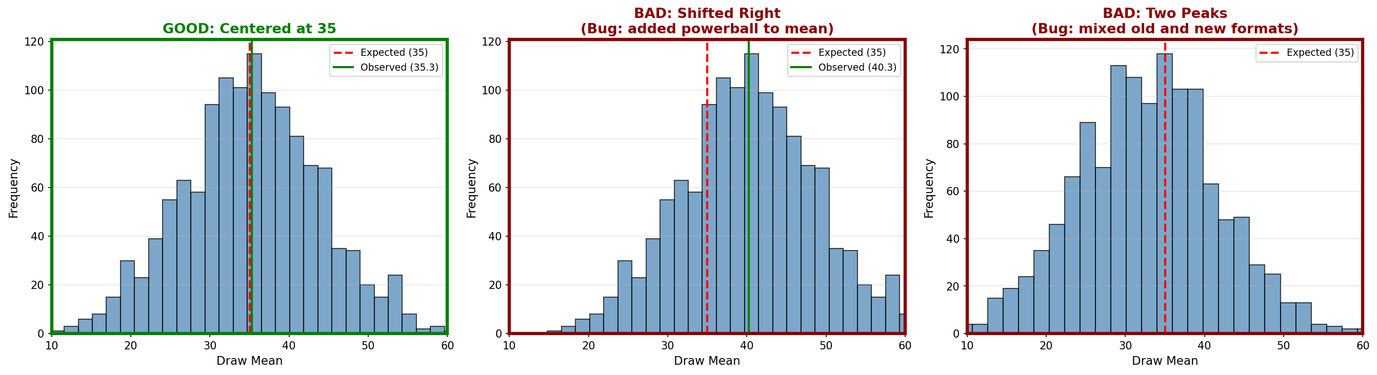
- The histogram should be bell-shaped
- It should center near the red dashed line (35)
- The green line (observed average) should be very close to the red line
- Shifted left or right (middle panel): Notice in the middle panel of the reference image how adding the Powerball shifts the entire bell curve to the right (to 40.3). If your green line is not overlapping your red line, you likely have a similar logic error.
- Two peaks (right panel): This indicates mixed data from different formats
- Very narrow or very wide: Wrong formula in the calculation
Compare your output to these reference examples:
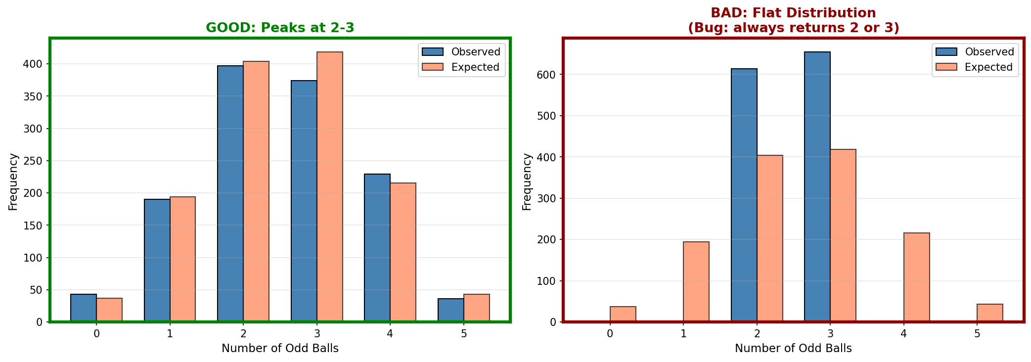
- The blue bars (observed) should closely match the coral bars (expected). The coral bars are the gold standard here.
- In the GOOD example, your blue bars should hug the coral bars almost perfectly
- Both should peak at 2 and 3
- Counts at 0 and 5 should be small
- Flat distribution (right panel): Parity counting is broken
- Peak at wrong values: Logic error in odd/even detection
Compare your output to these reference examples:

- All bars should be roughly the same height
- The 0-9 bar might be slightly shorter (only 9 numbers in that decade)
- No bar should be zero or drastically higher than others
- One bar is zero (right panel): That decade never got counted, likely a missing elif case in your code
- One bar way higher: Decade counting logic has a bug
Compare your output to these reference examples:
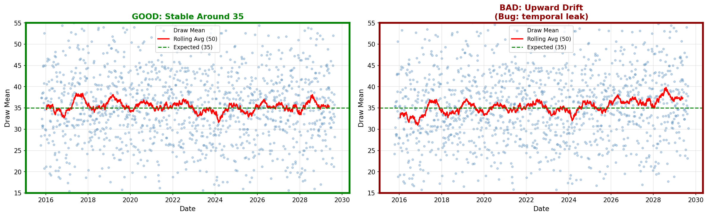
- The points should scatter around the green line (35)
- The red rolling average should stay close to 35
- No clear upward or downward trend
- Trend upward (right panel): Temporal bug or data corruption
- Trend downward: Same issue
- Sudden jump at a date: Format change or data quality issue
8. What You Now Understand (and why it matters later)
You know how to perform systematic checks on a feature table. You can compute summary statistics and visualize distributions. You understand what "correct" looks like for random lottery data.
You understand that EDA is not optional. It is the verification step that protects you from wasting time on broken data. If distributions look wrong, you debug now rather than after investing weeks in modeling.
Tutorial 4 will run formal probability tests (chi-squared, runs tests). Those tests assume the data is clean. Tutorial 3 confirmed that assumption.